
Logo design and branding · Adelaide
Logos and brand guidelines for businesses that want to look like one business.
A logo ends up on a website, a work vehicle, a business card and a browser tab the size of a fingernail. I design them to cope with all of that, and write down how to use them so nobody has to guess.
First impressions
First impressions count
People see your logo on a work vehicle, a business card or the top of your website before they read a word you’ve written. In that moment they’re deciding whether you’re good at what you do.
If the work is excellent and the logo looks like an afterthought, the logo is what they’ll believe. So the logo and the website need to be as good as the service behind them. A business with 25 years of quality work shouldn’t be introduced by something that undersells it.
What makes a good logo
Adaptability
One logo, a lot of places
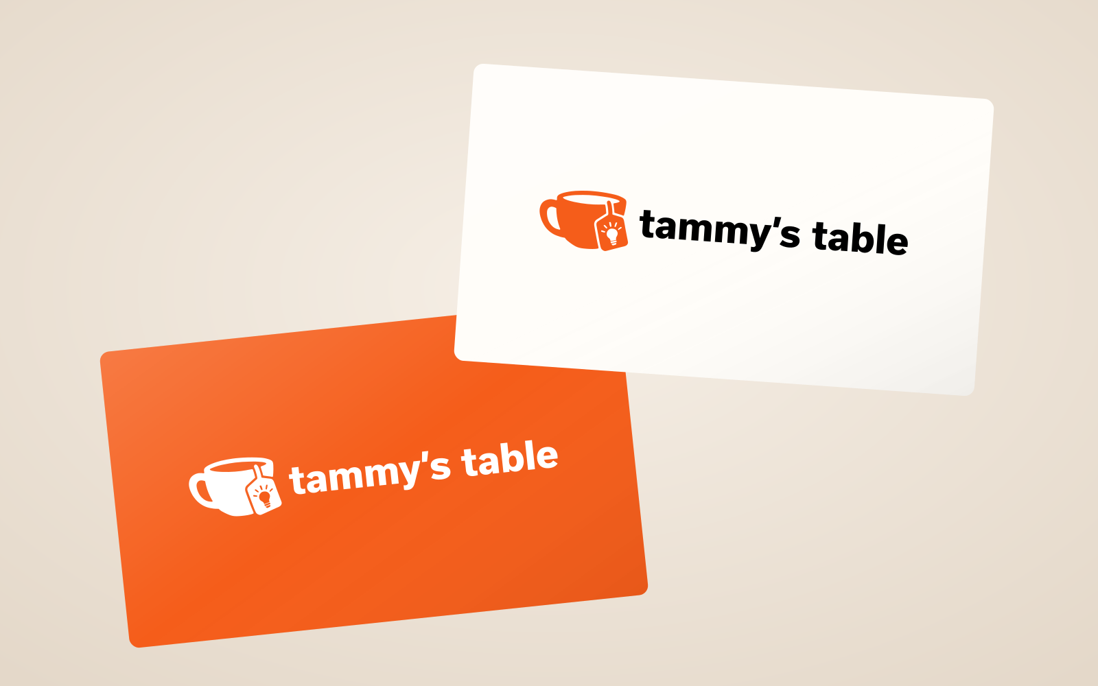
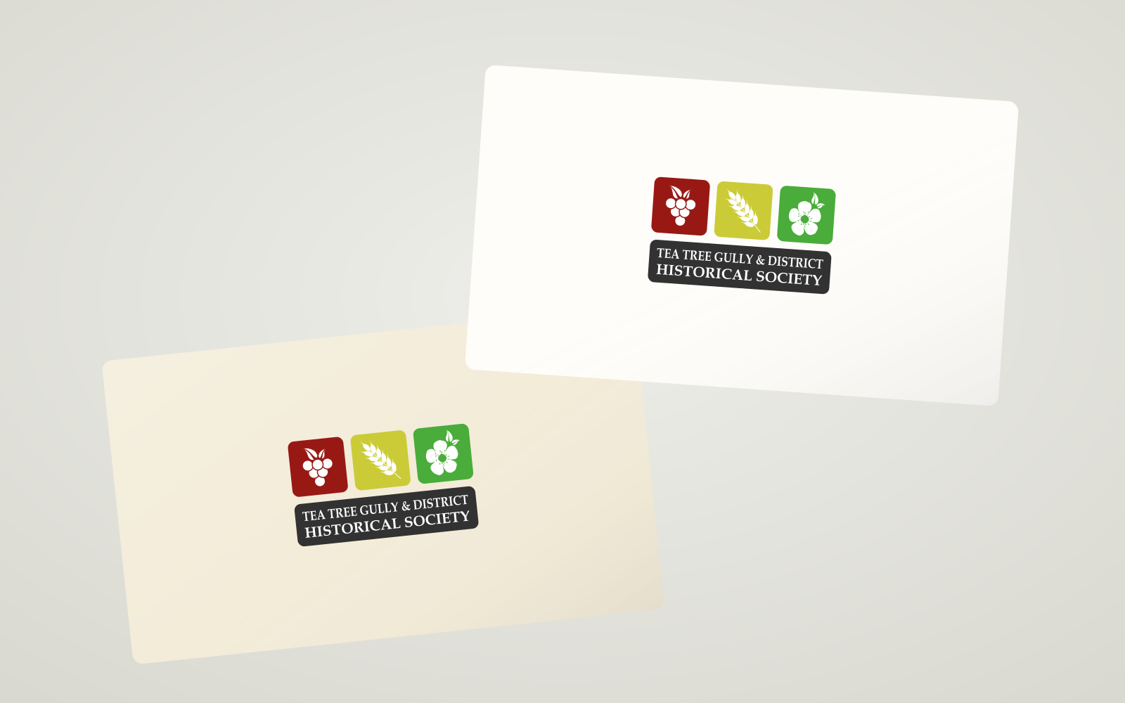
The same logo ends up on a work ute, a coffee mug, a notebook, a brochure and a lot of other places. So I design a small family: the full logo, usually a stacked version, the mark on its own for tight spaces, a one-colour version and a reversed one for dark backgrounds.
Rebrands and refreshes
Then and now
Some of these were a full rebrand and some were a tidy-up.
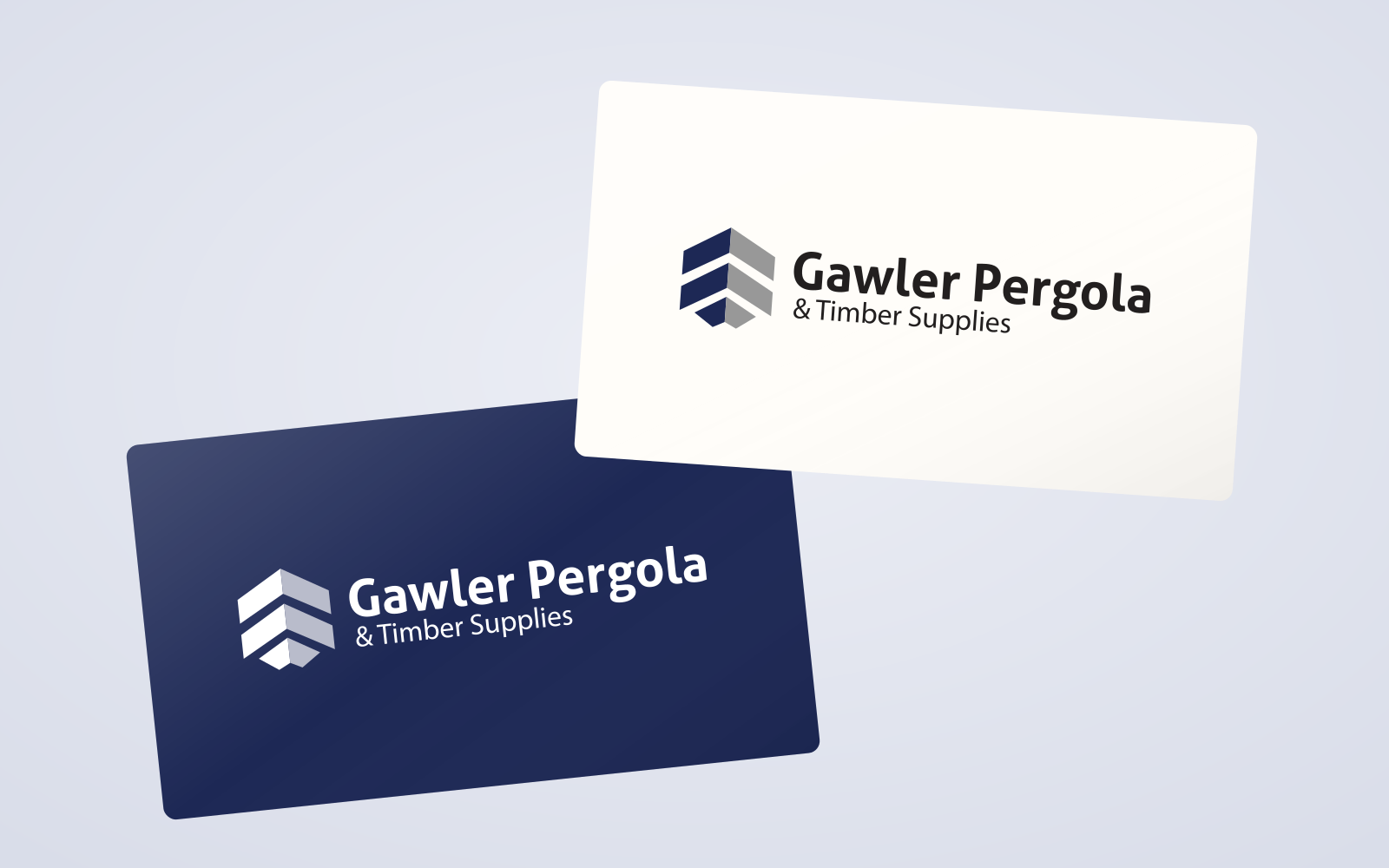
Gawler Timber & Pergolas
A brand-new logo for a business with more than 25 years in the trade.
See the project →Before
After

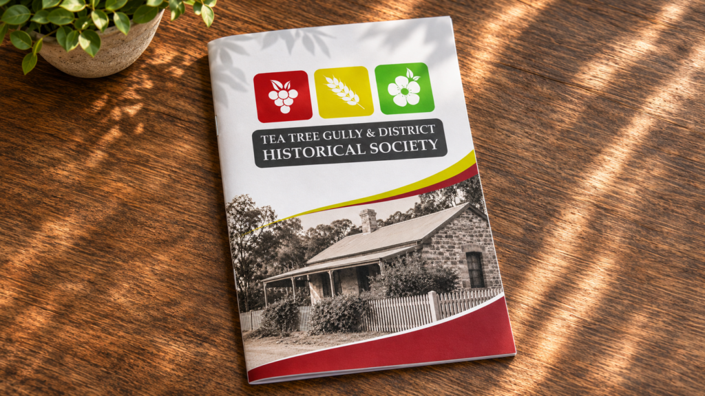
TTG & District Historical Society
The same three symbols, the grapes, wheat and tea tree flower, simplified so they work small.
See the project →Before
After
Before

After

Tammy’s Table
The old badge already had a lightbulb in the tea tag, but it was too small to see. The new logo keeps the idea and makes it clear.
See the project →Before

After

Before
After

David’s work is truly exceptional! He not only revamped my logo and website but also guided me through the selection of my new branding colors. His ability to include my personality into the website while elevating its level of professionalism was amazing. David’s technical knowledge combined with his creativeness had an instant positive impact on the quality of customer inquiries I received.
Can you update my existing logo instead of starting again?
Often, yes. If the idea behind it is good and the execution is what’s letting it down, I’ll keep the idea and fix the rest. If it isn’t, I’ll tell you.
Do I need a brand guide?
Not always. If you’re the only person who ever uses the logo, probably not. Once a printer, a signwriter, a social media person or a new staff member is involved, it saves a lot of “is that the right orange?”.
Can you do the logo and the website together?
That’s the easiest way. The colours and fonts get chosen once, and the site is built from them. I can also design a logo on its own.
What do I end up with?
The logo in the formats you’ll need for web and print, and a brand guide if you’ve asked for one.
What does it cost?
It depends on what you need. Tidying up an existing logo is a smaller job than a new identity with a guide. Tell me what you’re after and I’ll give you a price before I start.
Need a logo, or a tidy-up of the one you’ve got?
Tell me about the business and what you’d like the logo to do. If it’s not something I’d do well, I’ll say so.